
    @UITableColumn(flexGrow = 10)
    @UILabel(position = 10, label = "Name")
    public String getName() {
        return contact.getName();
}UI Components
Tables
There are two ways to create a table:
-
Using a class that implements
ContainerPmo -
Using the annotation
@UITableComponenton a method providing the rows in a layout
In both cases, the columns of the table are defined in a row PMO.
Definition of the table structure with a row PMO
The structure of the table is defined in a PMO class, whose instances represent rows in the table. Thus, these classes are called "row PMOs".
Row PMO classes are just like other PMOs, but is not annotated with a layout annotation such as @UISection.
Each UI element in the row PMO defines a column in the table.
Example implementation of a row PMO
Every PMO property specifies the setup of the column as well as the concrete field inside the table’s cell. Next to all aspects that are provided by @UITableColumn it takes the label from the field definition.
| The properties of a table column are described using the properties in the row PMO. But these properties cannot be bound to any specific row PMO instance (there might be none if the table is empty or many if there are multiple rows). Hence, all bindings are directed to the row PMO class. That also means: If you want to translate a column label the key is created using the class name of the row PMO. |
Column configuration using @UITableColumn
The annotation @UITableColumn can be used on annotated methods to customize additions aspects of a table column.
- Column width
-
You can use the properties
width(in pixels) andflexGrowto modify the column size. TheflexGrowspecifies what amount of the available space inside the table the column should take up and grow (if resized), proportionally to the other columns. IfflexGrowis set to 0, the column has a fixedwidth.
- Collapsible columns
-
The property
collapsiblecan make a column collapsible, i.e. the user can toggle the visibility of a column. It also defines if a collapsible column should be initially collapsed.This feature only works if the table is created inside a section. If there are any collapsible columns in the table, a right aligned header menu is displayed in the created section with which the user can toggle the visibility of a collapsible column. Setting the visibility of a column programmatically after the GridSectionhas already been created should be done usingGridSection#setColumnVisible(String columnKey, boolean visible)instead ofGrid#getColumnByKey()to make sure that the checked state of itsMenuItemis set correctly!
- Sortable columns
-
The property
sortableallows the column to be sorted. The data type of the column value must implementComparable, which defines the order in which the values are sorted.Model bindings ( modelAttribute) can not be used with sortable columns, a getter method must be used. - Text alignment
-
It is possible to customize text alignment inside of individual columns by setting the
textAlignvalue of the@UITableColumnannotation. The alignment also applies to the header and footer of the column.
Defining a table with Container PMO
The interface ContainerPMO can be used to define a table. A container PMO defines the row PMOs that should be rendered in the table, as well as additional table properties such as the table height and table selection behavior.
A table component can be created from a container PMO by using GridComponentCreator.
Creating a table using ContainerPMO and GridComponentCreator
Grid<ExampleRowPmo> grid = GridComponentCreator.createGrid(new ExampleTablePmo(partners), bindingContext);Alternatively, the container PMO can be annotated with @UISection to display the table in a TableSection. The section caption then functions as a caption for the table.
ContainerPmo Interface
In general, a container PMO has to implement the interface ContainerPmo<ROW>. The type parameter ROW is the row PMO class that defines the table structure.
The method List<ROW> getItems() is called by the ContainerBinding to add the elements to the table. It should always return the same instance of List<ROW> as long as the items do not change. The SimpleItemSupplier offers support for that.
By overriding the default method int getPageLength() the number of rows shown can be controlled. By default, 15 rows are shown. It is a common practice to allow tables to 'grow' to a certain size and then limit the number of lines while also enabling the scrolling for the table. If 0 is returned the table grows dynamically with the content, without limit.
    @Override
    public int getPageLength() {
        return 0;
    }
The column structure of the table is determined by the row PMO class, which is returned by the method Class<? extends ROW> getItemPmoClass. In the default implementation the class of the generic parameter ROW is returned. To support tables which are configured with other components for the cells, the method can be overwritten and return a subclass of ROW.
If the table should support the adding of items, the default method Optional<ButtonPmo> getAddItemButtonPmo must be overwritten. How a ButtonPmo is created is described in the chapter ButtonPmo.
SimpleTablePmo
Most commonly, the row PMO objects are converted from a list of model objects. In this case, the abstract class org.linkki.core.defaults.columnbased.pmo.SimpleTablePmo<MO, ROW> may be extended. It defines a constructor that requires the list or the supplier for the list of model objects. Additionally the method createRow(MO) needs to be implemented. This method simply takes a model object and creates a row PMO for it and is only called once for every model object. A simple example may look like this:
@UISection
public class SimpleContactTablePmo extends SimpleTablePmo<Contact, ContactRowPmo> {

    private final Consumer<Contact> editAction;
    private final Consumer<Contact> deleteAction;

    public SimpleContactTablePmo(List<Contact> contacts, Consumer<Contact> editAction, Consumer<Contact> deleteAction) {
        super(contacts);
        this.editAction = editAction;
        this.deleteAction = deleteAction;
    }

    @Override
    protected ContactRowPmo createRow(Contact contact) {
        return new ContactRowPmo(contact, editAction, deleteAction);
    }
}
The SimpleTablePmo is an abstract convenience implementation of the ContainerPmo<ROW> interface.
Creating a table using @UITableComponent
A table component can be defined inside a layout by using the annotation @UITableComponent. The annotated method provides the row PMOs that are displayed in the table.
As the generic type of the return type is erased at runtime, the row PMO class needs to be provided to the annotation.
Defining a table with @UITableComponent
    @BindStyleNames(LumoUtility.Height.FULL)
    @BindPlaceholder("There are no person to be shown.")
    @UITableComponent(position = 0, rowPmoClass = PersonRowPmo.class)
    public List<PersonRowPmo> getRows() {
        return itemSupplier.get();
    }
If the return type is a CompletableFuture, the items of the table are set asynchronously.
This is particularly useful if the rows of the table are being retrieved form external systems.
Note that server push should be enabled if the changes should be reflected to the UI immediately. Otherwise, the changes are shown with the next server roundtrip.
|
If any thread local information such as authentication tokens are needed for fetching the items, they must be added to new threads when creating the |
|
|
SimpleItemSupplier
The SimpleItemSupplier<PMO, MO> is used to only create a new List<PMO>, if a row was changed. When using ContainerPmo interface directly, SimpleItemSupplier should be used if the displayed rows may change dynamically.
The instantiating is done with two parameters
-
modelObjectSupplierof typeSupplier<List<MO>>is called to access a list of the model objects -
mo2pmoMappingof typeFunction<MO, PMO>is called for the creation of a PMO for a model object
Example initializing of a SimpleItemSupplier
    public ContactTablePmo(List<Contact> contacts, Consumer<Contact> editAction, Consumer<Contact> deleteAction) {
        items = new SimpleItemSupplier<>(() -> contacts,
                p -> new ContactRowPmo(p, editAction, deleteAction));
    }
Hierarchical Tables
Sometimes, the data in a table should be grouped for presentation, for example when summarizing values over certain categories. In that case, the data represents a tree-like structure with parent-child-relationships between rows. The resulting table will be a Vaadin TreeTable which allows collapsing and showing the child-rows of a row.
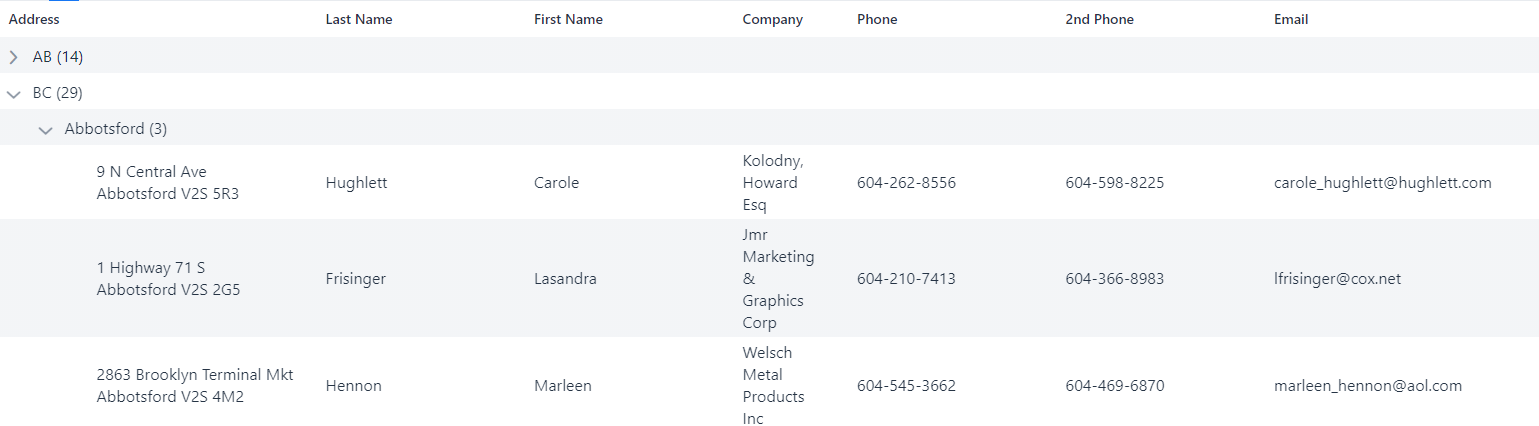
Figure 1. Hierarchical table
This can be realized by using org.linkki.core.defaults.columnbased.pmo.HierarchicalRowPmo<PMO>, row PMOs that contain further rows as children. It is possible to use multiple subclasses for row PMOs, using HierarchicalRowPmo only for collapsible rows. To indicate that the table contains hierarchical rows, the ContainerPmo should return true in the method isHierarchical(). By default, this method returns true if getItemPmoClass() returns a class that implements HierarchicalRowPmo, which means that all rows are collapsible.
public abstract class SummarizingPersonRowPmo extends AbstractPersonRowPmo
        implements HierarchicalRowPmo<AbstractPersonRowPmo> {

    private final List<? extends AbstractPersonRowPmo> childRows;

    public SummarizingPersonRowPmo(List<? extends AbstractPersonRowPmo> childRows) {
        this.childRows = childRows;
    }

    @Override
    public List<? extends AbstractPersonRowPmo> getChildRows() {
        return childRows;
    }
If the order of the rows might change due to user input, you should use a SimpleItemSupplier as with the ContainerPmo to avoid recreating the PMOs for unchanged rows.
    public CategoryRowPmo(Supplier<Stream<Player>> playerStreamSupplier,
            Function<Stream<Player>, Stream<CMO>> playersToChildModelObjectMapper,
            Function<CMO, CPMO> childModelObject2pmoMapping) {
        this.playerStreamSupplier = playerStreamSupplier;
        childRowSupplier = new SimpleItemSupplier<>(
                () -> playersToChildModelObjectMapper.apply(playerStreamSupplier.get()).collect(Collectors.toList()),
                childModelObject2pmoMapping);
    }
Row selection in tables
By default, table rows are not selectable. If table row selection should be possible,
the ContainerPmo implementation should implement either the SelectableTablePmo interface for single selection or the MultiSelectableTablePmo interface for multiple selections.
When implementing the SelectableTablePmo interface, it requires three methods:
-
ROW getSelection(): returns the selected row -
setSelection(ROW): sets the new selected row -
onDoubleClick(): executes action when a double click is made on the selected row. It is safe to assume thatsetSelection(ROW)is already called.
When implementing the MultiSelectableTablePmo interface, it requires only two methods:
-
Set<ROW> getSelection(): returns the selected rows -
setSelection(Set<ROW>): sets the new selected rows
However, in scenarios where selection is needed for visual reasons only, the @BindTableSelection(visualOnly = true) annotation can be applied. This allows tables to be made selectable without the need to implement any interface.
Example for a selectable table
public class PlaygroundSelectableTablePmo extends SimpleTablePmo<TableModelObject, PlaygroundRowPmo>
        implements SelectableTablePmo<PlaygroundRowPmo> {

    public static final String NOTIFICATION_DOUBLE_CLICK = "Double clicked on ";
    private PlaygroundRowPmo selected;

    // ...

    @Override
    public PlaygroundRowPmo getSelection() {
        return selected;
    }

    @Override
    public void setSelection(PlaygroundRowPmo selectedRow) {
        this.selected = selectedRow;
    }

    @Override
    public void onDoubleClick() {
        Notification.show(NOTIFICATION_DOUBLE_CLICK + selected.getModelObject().getName());
    }

}
Example for a visual only selectable table
@BindTableSelection(visualOnly = true)
public class VisualOnlySelectableTablePmo extends SimpleTablePmo<TableModelObject, PlaygroundRowPmo> {

    // ...

}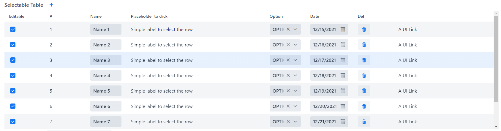
Figure 2. Example result
Example for a multi selectable table
public class PlaygroundMultiSelectableTablePmo extends SimpleTablePmo<TableModelObject, PlaygroundRowPmo>
        implements MultiSelectableTablePmo<PlaygroundRowPmo> {

    private Set<PlaygroundRowPmo> selectedRows;

    // ...

    @Override
    public Set<PlaygroundRowPmo> getSelection() {
        return selectedRows;
    }

    @Override
    public void setSelection(Set<PlaygroundRowPmo> selectedRows) {
        this.selectedRows = selectedRows;
    }

}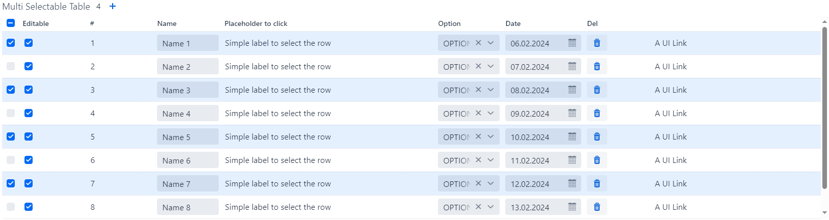
Figure 3. Example result
Placeholder
To display informative placeholder text when a table is devoid of data, leverage the @BindPlaceholder annotation. This annotation serves to notify users about the absence of items within the table. For a comprehensive understanding of placeholder configuration, refer to the Placeholder Configuration section for detailed explanations and behaviors.
Table footer
By overriding the default method getFooterPmo() a footer row is generated. The implementation of the interface TableFooterPmo must implement the method getFooterText(String column).
The parameter column is the ID of the column for which the text should be displayed. An example for this would be a sum of all items from a column.
    private final TableFooterPmo footer;

    public CarTablePmo(List<Car> carStorage, Handler addCarAction) {
        this.addCarAction = addCarAction;
        this.items = new SimpleItemSupplier<>(() -> carStorage, CarRowPmo::new);

        this.footer = c -> calculateTotalRetention(c, carStorage);
    }

    @Override
    public Optional<TableFooterPmo> getFooterPmo() {
        return Optional.of(footer);
    }

    private String calculateTotalRetention(String column, List<Car> cars) {
        switch (column) {
            case Car.PROPERTY_RETENTION:
                return new DecimalFormat("#,##0.00", DecimalFormatSymbols.getInstance(UiFramework.getLocale()))
                        .format(cars.stream()
                                .mapToDouble(Car::getRetention)
                                .sum());

            case Car.PROPERTY_CAR_TYPE:
                return "Total Retention:";

            default:
                return "";
        }
    }
The ContainerPMO can be annotated with @BindStyleNames and LinkkiApplicationTheme#GRID_FOOTER_BOLD to make the table footer text bold. This is particularly useful for columns which have a footer to show the sum of numbers.
To make the column right aligned use the textAlign property of @UITableColumn.
|
ButtonPmo
The interface ContainerPmo provides a method getAddItemButtonPmo(), by which a plus button can be added besides the name of the table.