
Logback
Release Notes
Version 2.6.7
New features and improvements
Dependency Updates
The following versions have been updated:
| Dependency | New version | Previous version |
|---|---|---|
1.5.21 |
1.5.20 |
Bugfixes
-
In version
2.6.5and2.6.6, the linkki-bom was published incorrectly and did not contain anydependencyManagemententries. This issue affects only versions2.6.5and2.6.6. Starting with2.6.7, the BOM has been fixed and works as expected.
Version 2.6.6
New features and improvements
Dependency Updates
The following versions have been updated:
| Dependency | New version | Previous version |
|---|---|---|
Spring Boot |
3.3.13 |
3.3.12 |
Netty |
4.1.127.Final |
4.1.121.Final |
Faktor-IPS |
24.7.9.release |
24.7.8.release |
Version 2.6.5
New features and improvements
Dependency Updates
The following versions have been updated:
Spring Boot |
3.3.12 |
Netty |
4.1.121.Final |
Version 2.6.4
New features and improvements
Dependency Updates
The following versions have been updated:
Faktor-IPS |
24.7.8.release |
Spring Boot |
3.3.10 |
Netty |
4.1.119.Final |
Version 2.6.3
New features and improvements
Dependency Updates
The following versions have been updated:
Faktor-IPS |
24.7.6.release |
Vaadin |
24.4.22 |
Spring Boot |
3.3.7 |
Bugfixes
- Missing client event in custom fields
-
Due to a Vaadin bug in custom fields (https://github.com/vaadin/web-components/pull/8368) in some cases the new value that was entered was not sent to the server and therefore not saved in the PMO.
Version 2.6.2
New features and improvements
Dependency Updates
The following versions have been updated:
Faktor-IPS |
24.7.5.release |
Vaadin |
24.4.16 |
Spring Boot |
3.3.5 |
Automatically focus first applicable element in combobox
If a character or word is entered into a combobox and there is only one matching element, then this element gets selected automatically.
- Example
-
A combobox has the values UP, DOWN, LEFT, RIGHT.
If the user enters 'u', the entry UP is selected automatically.
If the user enters 't', there are two possible matches (LEFT and RIGHT) and therefore no entry is selected automatically.
Bugfixes
-
Previously, setting the value to
nullin@UIRadioButtonsfailed to check the appropriate radio button. Now, selectingnullcorrectly checks the "Not specified" radio button, ensuring proper representation.With this bug fix, the converter must now be able to handle null-valued presentation values. Although this was already part of the
Convertercontract, it can now lead to an exception inValueAspectDefinition.
Version 2.6.1
New features and improvements
Dependency Updates
The following versions have been updated:
Vaadin |
24.4.4 |
Bugfixes
-
Card sections theme now only applies to dialogs if the theme is explicitly set on the dialog itself or a child layout.
-
The items of a table created with
@UITableComponentare now only fetched asynchronously if the return type isCompletableFuture. The documentation is updated accordingly.
- Disabled and readonly style for radio button and checkbox
-
The disabled and readonly style of radio buttons and checkboxes has been harmonised to follow the linkki style guidelines.
DefaultCaptionProvideruses the providedLocale-
If the provided
Localeisnull, it defaults toUiFramework.getLocale(). It does not ignore the providedLocaleforBooleancaptions anymore.
- Scrollbar on required components with an empty/ blank label
-
Components within a form layout that are required and have an empty/ blank label do not scroll anymore. The required indicator is always visible at the right upper corner of the label.
Version 2.6.0
New features and improvements
Dependency Updates
The following versions have been updated:
Faktor-IPS |
24.7.1.release |
Vaadin |
24.4.3 |
Spring Boot |
3.3.1 |
The new Vaadin version brings some notable improvements and changes that affect linkki applications:
- Using React components from Flow
-
React components can now be easily used in Vaadin Flow applications. Details are described in the Vaadin documentation.
- Improvements for Checkbox
-
Checkboxes can now display validation messages also display required indicator in layouts other than
@UISection. For more information, check out the Vaadin documentation for checkbox.
- Breaking Change in Vaadin Testbench
-
The method
ElementQuery.id(…)will now throw an exception if multiple elements with the same id are present, instead of returning the first matching item.MigrationTo switch back to the old behavior, you have to change the id(…) call to withId(…).first(). A better approach would be to first narrow the scope to ensure that the requested element only exists once within this scope.
- Open tab in dev mode less often
-
When Vaadin application is started in dev mode, it always opens a new tab in browser. This quickly leads to many tabs opened in browser. This behavior is now changed: a new tab is only opened if the server is restarted again after 30 minutes. Otherwise, the browser tab is reused. This duration can be modified, see Vaadin documentation.
- Relocation of
/frontendand renaming of generated bundles -
Vaadin 24.4.3 uses
src/main/frontend/directory as a default location of frontend resources, which is more natural for Maven projects. Additionally, the generated bundles are now renamed fromdev-bundletodev.bundle.MigrationExisting non generated content in
/frontendshould be moved to the new location.The
.gitignorefile may need to be adjusted too to accommodate the changes. To make it easier to maintain the.gitignorein the future, a new documentation is added which provides template for linkki projects. - Misleading warning during Maven build
-
If there are no Hilla dependencies on the classpath, e.g. in JEE projects, the following warning may occur during the maven build:
[WARNING] The 'configure' goal is only meant to be used in Hilla projects with endpoints.This warning is a false positive because of a bug in Vaadin (details) and can be ignored.
- Product build failure when using Spring Data JPA
-
When using Spring Data JPA, exception may occur during the Maven production build using
build-frontend, caused by aClassNotFoundExceptionfor example for the classApplicationPublisherAware. This occurs particularly if the@EnableJpaRepositoriesannotation is on the same class as@Theme(details).MigrationOne possible workaround is to move the implementation of the
AppShellConfiguratorinto a different class. Alternatively, the annotation for Spring Data JPA such as@EnabledJpaRepositoriescan be moved to a separate configuration class.
Details on all changes can be found in the Vaadin 24.4.3 release notes.
- Additional dependencies in vaadin-spring–boot-starter
-
The Maven dependency
vaadin-spring-boot-starternow includes the Hilla dependency by default, which introduces several transitive dependencies such as Spring Security or Swagger. Some of these dependencies may cause build issues.MigrationExplicitly include the necessary Spring Boot Starters and Vaadin Spring dependency
vaadin-springinstead. Alternatively, the Hilla dependencycom.vaadin:hillacan be excluded from thevaadin-spring-boot-starterdependency.
New BOM module for dependency management
The new linkki BOM module manages the versions and scopes of all linkki dependencies.
To use the BOM module, simply import the BOM dependency in the dependency management of your project. Any version and scope configurations of linkki dependencies can then be removed.
<dependency>
    <groupId>org.linkki-framework</groupId>
    <artifactId>linkki-bom</artifactId>
    <version>2.6.0</version>
    <type>pom</type>
    <scope>import</scope>
</dependency>
New annotation for tables: @UITableComponent
A new UI component @UITableComponent is now available, providing a new way to create tables directly on a method instead of a class.
Example usage of @UITableComponent
    @BindStyleNames(LumoUtility.Height.FULL)
    @BindPlaceholder("There are no rows available.")
    @UITableComponent(position = 0, rowPmoClass = PersonRowPmo.class)
    public List<PersonRowPmo> getRows() {
        return itemSupplier.get();
    }
If server push is enabled and and the return type is a CompletableFuture, the items of the table are set asynchronously.
This is particularly useful if the rows of the table must be retrieved form external systems.
This new annotation has several advantages comparing to the definition of tables using ContainerPmo/SimpleTablePmo:
-
No PMO class is required to create a table. This makes it easier to combine tables with other components in a layout.
-
It is easy to style the table itself. When using
ContainerPmo, it is only possible to add style names to the section. If the table itself has to be modified, the created component has to be cast toGridSectionto retrieve theGridcomponent. With@UITableComponent, styles names can be directly applied to the table by usingBindStyleNames.
Further details can be found in the documentation.
|
|
Multi-selection in tables
-
The
BindTableSelectionnow includes a new attribute calledselectionMode. Its default value isGrid.SelectionMode.SINGLE. -
A new interface
MultiSelectableTablePmohas been added. WhileSelectableTablePmodefines the necessary methods when theselectionModeisGrid.SelectionMode.SINGLE, so does the interfaceMultiSelectableTablePmofor whenselectionModeisGrid.SelectionMode.MULTI.
Further information can be found in the documentation.
Boolean support for UIComboBox and UIRadioButtons
-
Booleans in
UIComboBoxandUIRadioButtonsare now displayed with user-friendly text. No additional caption provider needs to be set. For more details, see documentation for UIComboBox and UIRadioButtons. -
UIYesNoComboBoxis deprecated and can be replaced withUIComboBox.
Improvements in datatype conversion
- New converters for
GregorianCalendarandMoney -
Converters have been added for
GregorianCalendarandMoneythat make them usable withString-valued UI components such as@UITextField.
TheStringToGregorianCalendarConverteris integrated into the LinkkiConverterRegistry and can be used with@UITextFieldor@UILabeldirectly.
StringToMoneyConverterhas be added in the Faktor-IPS extension. Its functionality is documented here. This converter is not applied by default, thus have to be added to the converter registry if needed.
- Changed String format for
Date -
In the previous version,
Datevalues has been converted to String using the converter provided by Vaadin format, which displays a date asJan 12, 1952in the English locale. This behavior is not consistent with the presentation inUIDateField. Thus, a newStringToDateConverterhas been introduced which presents a date as01/01/1952in English, and01.01.1952in German.
- Improved behavior with overflowing integers
-
Input values in a
@UIIntegerFieldthat exceed the maximum allowed integer do not overflow anymore. Instead, an error is displayed and the field is reset to its previous valid input.
- Consistent naming for number converters
-
The number converters have been deprecated and replaced with new ones that match the correct naming schema, using the presentation type first.
Old class
New class
FormattedNumberToStringConverterFormattedStringToNumberConverterFormattedIntegerToStringConverterFormattedStringToIntegerConverterFormattedDoubleToStringConverterFormattedStringToDoubleConverterFormattedDecimalFieldToStringConverterFormattedStringToDecimalConverterThe converters are used by the corresponding UI annotations by default. Changes are only necessary if FormattedNumberToStringConverterwas extended.
New VisibleType INVISIBLE_IF_EMPTY
A new enum value, INVISIBLE_IF_EMPTY, is now available in VisibleType.
When used, the VisibleAspectDefinition evaluates the linked method’s output.
Components linked to this method will be hidden if the result is null or an empty String, enhancing UI cleanliness.
Further details can be found in the documentation.
New visual for card like sections
linkki provides a theme card-like-pages that can make all contained sections have a card alike appearance by giving the content of sections a background color.
This theme makes AbstractPage component that contain sections appear more structured.
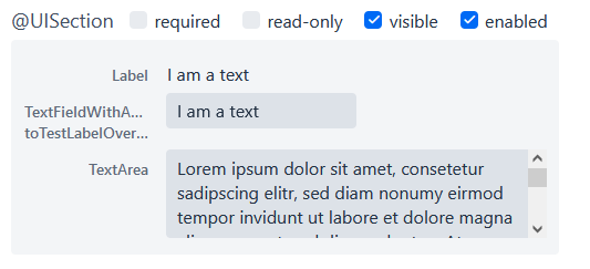
Figure 1. card-like-pages theme in previous version
This theme has been reworked:
|
Notable Changes
|
To reflect the changes, following constants have been renamed:
Class |
Old name |
New name |
LinkkiTheme |
VARIANT_CARD_SECTION_PAGES |
VARIANT_CARD_SECTIONS |
LinkkiSection |
CLASS_SECTION_STYLE_CARD |
THEME_VARIANT_CARD |
See section "Theme Variants" for more details on how to use the theme variant.
Customizable position of the loading indicator
When using application header, the loading indicator has the same color as the header, making it effectively invisible. To mitigate this problem, the loading indicator was moved to the bottom of the page by default.
The position of the loading indicator can be configured with two new css properties in the linkki theme:
-
--linkki-loading-indicator-top
-
--linkki-loading-indicator-bottom
| In de linkki theme the loading indicator is configured to be displayed at the bottom of the page by default. |
For more details see loading indicator.
Improvements for Karibu support
KaribuUtils has been extended to provide better support for unit testing linkki applications:
- Support for push UI
-
As the push functionality is provided by Atmosphere thus does not work out of the box with Karibu, the method
KaribuUtils.UI.push()andKaribuUtils.UI.push(UI)can be used to flush the command queue manually. - Support for OkCancelDialog
-
A new inner class
KaribuUtils.Dialogshas be added to provide methods that makes it easy to interact withOkCancelDialog. - Improved support for Notification
-
The methods for
Notificationare moved to an inner classNotifications. Additionally, methods are added to retrieve the severity, description, and content components in the notification. - Support for fields
-
The method
setValueofAbstractFielddoes not fire value change events, making it difficult to test if the PMO was correctly updated. The new methodFields.setValuecan be now used to mitigate this problem.
Improvements of the documentation
- New documentation for CSS custom properties in the linkki Theme
-
linkki theme defines CSS custom properties which is the easiest way to customize the UI. These are now documented in chapter "Styling".
- New documentation for
.gitignore -
A template
.gitignorefile is provided for linkki projects, making it more clear which Vaadin resources should not be included in Git.
- linkki tutorial in the documentation
-
The linkki tutorial is now part of this documentation (see Tutorial), making it easier to find.
Other
-
BindVariantNamesnow applies to all Vaadin components, expanding its functionality beyond its previous limitation to components that implemented HasTheme.
-
All Notifications (
info,warninganderror) now include a close button. Additionally, the default duration for warning notifications has been increased to6000 ms.
-
A new constructor has been added to the
DefaultCaptionProviderclass that accepts aLocaleparameter.
Bugfixes
Default Error Page Exception Handling
For better message handling in the LinkkiErrorPage a new MessageException was introduced.
-
On receiving a
MessageException, the error page shows the message of this exception in production as well as in development mode. -
On receiving any other exception:
-
In development mode: a custom message or the exception message is shown to the user.
-
In production mode: only a generic error message is shown to the user to hide any sensitive information.
-
Additionally logging for the thrown exception has been added. MessageExceptions are only logged if they contain a cause.
All other exceptions are logged anyways.
Width of nested components
The width of nested components was fixed.
Any value that is set as width on @UINestedComponent is now only applied to the layout element.
The nested component itself gets a width of 100%.
In the following example the wrapping element of the @UIVerticalLayout gets a width of 50% but the @UIVerticalLayout itself has full width.
@UINestedComponent(position = 10, width = "50%")
public PersonPmo getPerson() {
    return new PersonPmo();
}

@UIVerticalLayout
class PersonPmo  {

    @UITextField(position = 10, label = "Firstname")
    public String getFirstname() {
        return "Max";
    }

    @UITextField(position = 20, label = "Lastname")
    public String getLastname() {
        return "Mustermann";
    }

}