UI Components
LinkkiTabLayout
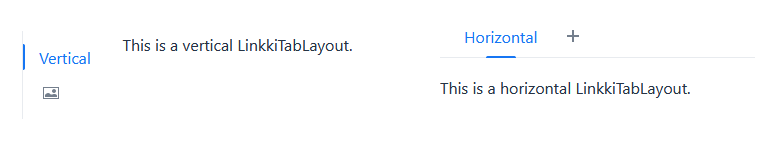
A component that allows switching between different contents, using either a horizontal or vertical tab bar. Only a single tab can be active at a time.
This is a replacement for the linkki Vaadin 8 SidebarSheet and TabSheetArea.
Create Tabs
Tabs are added to the layout using a LinkkiTabSheet. The tab sheet is created using a builder:
        LinkkiTabLayout linkkiTabLayout = new LinkkiTabLayout();
        linkkiTabLayout.addTabSheet(LinkkiTabSheet.builder("tabSheetId")
                .caption("Tab Sheet Caption")
                .content(this::createTabContent)
                .build());
To create a LinkkiTabSheet as sidebar layout, use newSidebarLayout(), and icons as captions. A description can also be provided which is displayed by hovering the mouse over the icon.
        LinkkiTabLayout linkkiTabLayout = LinkkiTabLayout.newSidebarLayout();
        linkkiTabLayout.addTabSheet(LinkkiTabSheet.builder("sidebarSheetId")
                .caption(VaadinIcon.ABACUS.create())
                .description("Sidebar One")
                .content(this::createSidebarContent)
                .build());
Toggle Visibility of Tabs
A tab can be dynamically set to visible or invisible by providing a BooleanSupplier in the builder of LinkkiTabSheet using the method visibleWhen(BooleanSupplier). The suppliers must return true to set the tab visible and false to set it invisible.
The method LinkkiTabLayout#updateSheetVisibility() must be triggered to update the visibility state. The method is automatically called by Vaadin’s AfterNavigationEvent, that means the visibility state is at least updated when there is a navigation to the view containing the tabs.
Selection Change Events
There are several possibilities to receive a selection change event in case a new tab is selected. All events are also triggered for the auto-selection when the first tab is added to the tab layout.
- Implement AfterTabSelectedObserver
-
Components implementing this interface will receive a
TabSheetSelectionChangeEventwhen theLinkkiTabSheetthey are attached to is selected. Additional details and limitations can be found in the javadoc ofAfterTabSelectedObserver. - Adding a listener to LinkkiTabLayout
-
Use the method
addSelectedChangeListener(ComponentEventListener<SelectedChangeEvent>)to get aSelectedChangeEventcontaining the selected tab. - Adding a listener to LinkkiTabSheet
-
It is also possible to add a listener directly to the
LinkkiTabSheetusingaddTabSelectionChangeListener(ComponentEventListener<TabSheetSelectionChangeEvent>). The returnedRegistrationcould be used to unregister the listener.
ComponentStyles
New utility class that offers several methods for styling UI components
-
setOverflowAuto(Component): Sets the overflow of the givenComponentto "auto". This makes theComponentautomatically scroll if necessary. -
setFormItemLabelWidth(Component, String): Sets the width of all form item labels in the givenComponent.