New & Noteworthy
1.3.0
Vaadin 7 modules removed
The modules vaadin7-core, vaadin7-application-framework and vaadin7-samples have been removed, along with any documentation specific to Vaadin 7.
Customizable button captions for OkCancelDialog
The text displayed on the OK and cancel buttons can now be changed using the okCaption and cancelCaption methods on the builder or the corresponding setters on the dialog.
New Kind of Section: @UIFormSection
In this version, we introduce a new section annotation: @UIFormSection.
@UISection is the most commonly used layout component when using linkki. It is characterized by its prominent header, which is followed by elements ordered as a form. While being very useful for most cases, it also brings some problems, both technical as well as practical. The new @UIFormSection offers a similar layout while tackling some of the known deficits.
- Consistent Alignment
-
One of the most frequent complaints about
@UISectionis the inconsistent alignment across different sections. This is due to the fact that the labels are always as wide as the longest label in a@UISection. With@UIFormSection, it is possible to use the same label width for all sections in a page, or any other layout. This results in nicely aligned lables and fields.As an example, you can unify the label width in all sections in a page by simply using
page.addStyleName(LinkkiTheme.LABEL_FIXED_WIDTH).This functionality is explained in more detail in the documentation of @UIFormSection.
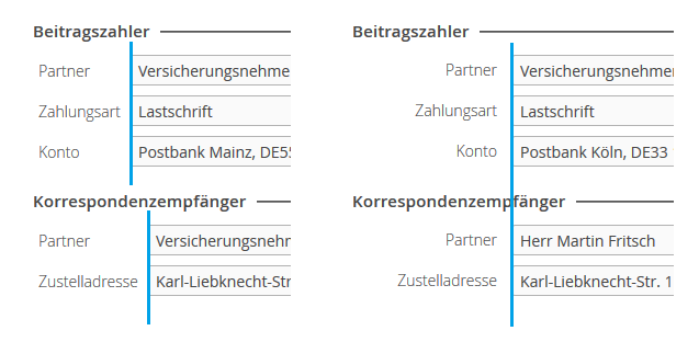
Figure 1. Field alignment across sections created with @UISection (left) and @UIFormSection (right) - Flexible Styling with CSS
-
On the more technical side,
@UISectioncreates aGridLayoutin which all sizes are calculated by javascript and set as inline style. As a consequence, it is very difficult to change sizes such as the label width with CSS. In contrary,@UIFormSectionuses aFormLayoutwhich is mostly styled with CSS. - Line Break of Longer Labels
-
Due to the length of labels being limited, labels that exceed the length will be broken into multiple lines. Consider rewording them to make them shorter, or increasing the label size.
- Single Column Layout
-
@UIFormSectiondoes not yet offer multi column layout. If the columns address different domain objects, consider creating two separate sections that are placed in a horizontal layout. If you are currently using a multicolumn section, please contact us to tell us your use case. To do so, please create a feature request on the linkki Github page or contact us directly. Thank you very much! - Converting Sections to the new @UIFormSection
-
In most cases you can directly change the annotation of your PMO class from
@UISectionto@UIFormSection. INFO: Sections that make use of thecolumnsattribute as well as any PMO classes that implement theContainerPmointerface (i.e.TableSections) have to continue using the@UISectionAnnotation.
Section Labels Are Now Right Aligned
All labels inside a section are now right aligned by default.
If you want to keep the left alignment, define the following variable value in your SCSS theme before importing linkki.scss:
$linkki-label-alignment: left;Required Indicator Moved
The required indicator is now displayed on the right of the label, instead fo right of the input field. This makes the required indicator more prominent to the user. Also, it is more consistent with components that are directly created with Vaadin.
New UI Annotation: @UILink
Up until now, there were two ways to create hyperlinks with linkki
-
Use a
@UIButtonthat is styled as a link. This approach has the disadvantage that the user do not have the context menu to control how to follow the link, or to copy the link. In addition, the displayed text also cannot be easily copied. -
Use a
@UILabelwith HTML content enabled. This is a relatively technical solution as the implementer has to directly write HTML code.
Now, linkki offers a @UILink annotation. The method that is annotated should return the link while the displayed text is determined by the caption aspect. The @UILink also offers a target attribute that specifies where to open the link. More detail can be found in the documentation.
@UILink(position = 0, caption = "Finally a link!", target = LinkTarget.BLANK)
public String getLinkki() {
  return "https://linkki-framework.org/";
}
New Aspect Annotation: @BindReadOnlyBehavior
By default buttons in linkki do not change their state in read-only-mode. This is due to the fact that a button in vaadin has no read-only state. Depending on the usecase, a button in read-only-mode should either be disabled, invisible or it should remain active.
With the new annotation @BindReadOnlyBehavior, a component will automatically change its enabled or visible behavior when in read-only mode. This is especially useful for buttons but is also applicable for other components.
In combination with input fields, the annotation can also be used to keep those components active in read-only-mode. For example, an input field that can be used to filter some content should be active even though the user interface is in read-only-mode.
Further details can be found in the chapter Bind Read-Only Behavior.
New Aspect Annotation: @BindIcon
Dynamic icon has been a frequently requested feature for button. Although it is very easy to create such an aspect by oneself, it is so commonly needed that linkki now welcomes a new member in its family: the @BindIcon annotation. Besides buttons, this annotation is also useful for the new @UILink annotation to indicate external links if needed.
More convenient dynamic binding with @Bind… annotations
For the annotations @BindTooltip and @BindCaption the default of the type was changed to the new type AUTO. Using this type it is no longer necessary to specify the type DYNAMIC explicitly while specifying no specific value.
For example simply write @BindTooltip instead of @BindTooltip(tooltipType = TooltipType.DYNAMIC) to get a dynamic tooltip binding.
ID Collision in Table Sections
When creating a table section from a PMO, the HTML elements of the table, as well as the section surrounding it, were both assigned the name of the PMO class as ID. This leads to ID collision. To avoid this, the ID of the table now has the suffix "_table".
This fix was backported to 1.2.2.
Nested Components
Using the annoation @UiNestedComponent, a PMO can include further PMOs. More advanced layouts and a cleaner seperation of PMO classes are thus possible.
This replaces the old incubator project.
Update Vaadin to 8.12
linkki now uses Vaadin version 8.12.1 to include the latest bug fixes and patches. Have a look at the list of dependencies.