UI Components
LinkkiTabLayout
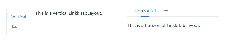
A component that allows switching between different contents, using either a horizontal or vertical tab bar. Only a single tab can be active at a time.
This is a replacement for the linkki Vaadin 8 SidebarSheet and TabSheetArea.
Create Tabs
Tabs are added to the layout using a LinkkiTabSheet. The tab sheet is created using a builder:
        LinkkiTabLayout linkkiTabLayout = new LinkkiTabLayout();
        linkkiTabLayout.addTabSheet(LinkkiTabSheet.builder("tabSheetId")
                .caption("Tab Sheet Caption")
                .content(this::createTabContent)
                .build());
To create a LinkkiTabSheet as sidebar layout, use newSidebarLayout(), and icons as captions. A description can also be provided which is displayed by hovering the mouse over the icon.
        LinkkiTabLayout linkkiTabLayout = LinkkiTabLayout.newSidebarLayout();
        linkkiTabLayout.addTabSheet(LinkkiTabSheet.builder("sidebarSheetId")
                .caption(VaadinIcon.ABACUS.create())
                .description("Sidebar One")
                .content(this::createSidebarContent)
                .build());
Toggle Visibility of Tabs
A tab can be dynamically set to visible or invisible by providing a BooleanSupplier in the builder of LinkkiTabSheet using the method visibleWhen(BooleanSupplier). The suppliers must return true to set the tab visible and false to set it invisible.
The method LinkkiTabLayout#updateSheetVisibility() must be triggered to update the visibility state. The method is automatically called by Vaadin’s AfterNavigationEvent, that means the visibility state is at least updated when there is a navigation to the view containing the tabs.
Selection Change Events
There are several possibilities to receive a selection change event in case a new tab is selected. All events are also triggered for the auto-selection when the first tab is added to the tab layout.
- Implement AfterNavigationObserver
-
The recommended way is to implement the interface
AfterNavigationObserverin the content layout. Any component that is part of the selected tab gets the event if it is attached and visible at the time the tab is selected. - Adding a listener to LinkkiTabLayout
-
Use the method
addSelectedChangeListener(ComponentEventListener<SelectedChangeEvent>)to get aSelectedChangeEventcontaining the selected tab. - Adding a listener to LinkkiTabSheet
-
It is also possible to add a listener directly to the
LinkkiTabSheetusingaddTabSelectionChangeListener(ComponentEventListener<TabSheetSelectionChangeEvent>). The returnedRegistrationcould be used to unregister the listener.
ComponentStyles
New utility class that offers several methods for styling UI components
-
setOverflowAuto(Component): Sets the overflow of the givenComponentto "auto". This makes theComponentautomatically scroll if necessary. -
setFormItemLabelWidth(Component, String): Sets the width of all form item labels in the givenComponent.