@UISection(caption = "Common Data", closeable = true)
public class CommonDataSectionPmo {

    // ...

}UI Components
Layouts
linkki provides some standard layout annotations which are described here. If you need another layout it is quite easy to create custom layout annotations.
Section
A group of input fields is called section.
- Section Header
-
A section usually has a section header that contains a descriptive title which summarizes the content of the input group. This titled is visually separated from the content by a separating line in the header. Without a section header, a section is not directly recognizable as such, but looks like a simple layout.
A section may be closable with a button in the section header. When closed, its content is collapsed to give a better overview about the whole page. - Content
-
The input fields of a section is typically ordered as a form, field description being on the left of the input elements. Instead of input fields, the content of a section can also be a table. If a section contains a table instead of multiple input fields it is called TableSection.
linkki offers two annotations to create a section:
-
@UISection -
@UIFormSection
Both annotations share the attribute to controll the content of the section header:
-
caption: short description of the section -
closable: whether the section can be collapsed
Differences between @UISection and @UIFormSection
-
A
@UISectionuses aGridLayoutwhile@UIFormSectionuses aFormLayout, making it easier to customize with CSS. -
@UISectioncan be used to create aTableSectionif the PMO class is a Container PMO.@UIFormSectiondoes not have this functionality. -
@UISectionhas multiple layout options including a multi column layout,@UIFormSectiononly offers single column. -
@UIFormSectionscan have a fixed label width to align multiple sections. Label width in@UISectionis determined by the longest label in each section.
Label width in @UIFormSection
By default, the labels in a section take up as much space as the longest label in the section. When display multiple sections below each other, that often has the undesired effect that each section has a different label width.
To mitigate this issue, LinkkiTheme offers two style names that can be applied to the surrounding layout such as AbstractPage:
-
LABEL_FIXED_WIDTH: All@UIFormSectionsin the layout have a fixed label width, by default9em. -
LABEL_FIXED_WIDTH_LONG: All@UIFormSectionsin the layout have a long fixed label width, by default12em.- Customization
-
Both widths can be customized globally in the SCSS theme. The width of
LABEL_FIXED_WIDTHcan be customized by defining the variable value$linkki-label-fixed-widthin the SCSS. The width ofLABEL_FIXED_WIDTH_LONGis defined by the variable$linkki-caption-fixed-width-long. Note that it is important to defined the variable value before importinglinkki.scss. - Line Break in Labels
-
With a fixed label width, labels that exceed the defined width are broken into multiple lines. The line breaks at white spaces whenever possible. If your label does not have any white spaces, this may cause a line break at an unexpected place, which may impair readability.
Layout Options in @UISection
The layout for all the components within a UISection can be defined with the attribute layout. linkki defines the possible layouts in the enum SectionLayout: HORIZONTAL, COLUMN or CUSTOM.
.
- Horizontal Section Layout
-
With the horizontal layout all input fields are displayed on a line, side by side in the order of their position. The attribute
columnsis ignored.
- Column Section Layout
-
With the column layout fields are displayed one below the other. If additionally a number of columns are defined with the property
columns, a kind of grid layout is produced. The grid is filled in the order of the field’s position from left to right, row by row.
- Custom Section Layout
-
Custom layout does not directly define the layout but gives the ability to create a HTML file containing the exact position of each control. Therefore it uses the CustomLayout from Vaadin.
All you have to do is to create a HTML file located in the
layoutsfolder in your theme folder. The HTML file has to be named with the simple name of your PMO and use the file extension.html. Within this HTML file you use<div location="…">elements as placeholder for every component. Within thelocationattribute you use the PMO property name to reference the component as needed. If you also want to have the placeholder for the PMO defined label you simply use the PMO property name with the suffix-label. In the PMO there are no restrictions. The position will be ignored, as it is determined by the HTML template.As an example, custom layout can be used to create a address input section where the fields "Street" and "Number" are shown in the same line with a predefined width, as well as the fields "Zip" and "City".
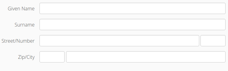
The relevant code for the class declaration and a part of the field declarations are given in this code snippet.
@UISection(caption = "Address", layout = SectionLayout.CUSTOM)
public class AddressSectionPmo {
...
    @UITextField(position = 2, label = "Street")
    public String getStreet() {
        return street;
    }

    public void setStreet(String street) {
        this.street = street;
    }

    @UITextField(position = 3, label = "Number")
    public String getNumber() {
        return number;
    }

    public void setNumber(String number) {
        this.number = number;
    }
The corresponding part of the html file may looks like this. The used css classes are not part of the default stylesheet.
<div class="line"> <div class="label"> <div location="street-label"></div> / <div location="number-label"></div> </div> <div class="component"> <div style="width: 100%;" location="street"></div> <div style="width: 6em;" location="number"></div> </div> </div>
Label alignment in sections
By default, the labels are right aligned in a section. A right alignment has the advantage that the label and the corresponding input control are always visually close. In case the length of the labels vary strongly in a section, left alignment can make a label appear far away from the input control itself. This can make the form look less ordered as the affiliation between the label and the input control is broken visually.
To change this behavior, declare $linkki-label-alignment: left before importing linkki.scss.
Adding UI Elements to the Section Header
To add more elements, for example an edit button, to the section’s header than just the caption, you can annotate regular UI elements in the section’s PMO with the @SectionHeader annotation. They will then be placed in the header instead of in the section’s content area.
    @SectionHeader
    @UIButton(position = -10, icon = VaadinIcons.AMBULANCE, showIcon = true, //
            captionType = CaptionType.NONE, styleNames = LinkkiTheme.BUTTON_TEXT)
    public void callAnAmbulance() {
The position is validated by linkki to be unique in the PMO independent of where the element will be placed in a section, so it is recommended to use negative numbers for the elements marked with @SectionHeader to avoid conflicts with the regular elements.
|
The same effect could previously be achieved by implementing the interface PresentationModelObject with the method getEditButtonPmo() where the returned ButtonPmo defines the button and its behavior. As this allows only limited control over the button and no other elements, using a @SectionHeader annotated @UiButton like shown above is to be preferred.
|
Simple Vaadin Layouts
Beside the section there are some simple Vaadin layouts that can be created with the corresponding annotations:
-
@UIHorizontalLayout -
@UIVerticalLayout -
@UIFormLayout -
@UICssLayout
Some of these annotations may have special parameters to configure the alignment of the contained components.
To create the UI from a PMO with these layouts you should use VaadinUiCreator. The PmoBasedSectionFactory is only usable for @UISection whereas the VaadinUiCreator could be used for all kinds of layouts.
|
SectionID
Each HTML element of a layout may define an ID. This can be used, for instance, to identify a section for UI testing. By default the simple name of the class is used as the ID. Alternatively the annotation '@SectionID' can be used to specify a method that returns the ID for the section.
A method annotated with '@SectionID' is called by linkki when the section is created. The ID remains the same for the duration of the session and is not updated dynamically.
To access the section ID, the helper method Sections.getSectionId(Object) may be used.
| Although the concept is named SectionID it is also applied to all kinds of layouts. |