@UISection(caption = "Common Data", closeable = true)
public class CommonDataSectionPmo {

    // ...

}UI Components
Layouts
linkki provides some standard layout annotations which are described here. If you need another layout it is quite easy to create custom layout annotations.
Section
A group of input fields is called section. A section usually has a descriptive title defined by the caption attribute. A line in the title bar visually separates the title from the content. Without a title, a section is not directly recognizable as such, but looks like a simple layout. Instead of input fields, the content can also consist of a table.
The section layout is defined by annotating a PMO with the annotation @UISection.
The section may be closable that means its content can be collapsed to give a better overview about the whole page. Simply configure this feature using the annotation attribute closeable.
The layout for all the components within the section can be defined with the attribute layout. linkki defines the possible layouts in the enum SectionLayout: HORIZONTAL, COLUMN or CUSTOM.
If a section contains a table instead of multiple input fields it is called TableSection.
Horizontal Section Layout
With the horizontal layout all input fields are displayed on a line, side by side in the order of their position. The attribute columns is ignored.
Column Section Layout
With the column layout fields are displayed one below the other. If additionally a number of columns are defined with the property columns, a kind of grid layout is produced. The grid is filled in the order of the field’s position from left to right, row by row.
Custom Section Layout
Custom layout does not directly define the layout but gives the ability to create a HTML file containing the exact position of each control. Therefore it uses the CustomLayout from Vaadin.
All you have to do is to create a HTML file located in the layouts folder in your theme folder. The HTML file has to be named with the simple name of your PMO and use the file extension .html. Within this HTML file you use <div location="…"> elements as placeholder for every component. Within the location attribute you use the PMO property name to reference the component as needed. If you also want to have the placeholder for the PMO defined label you simply use the PMO property name with the suffix -label. In the PMO there are no restrictions. The position will be ignored, as it is determined by the HTML template.
In this sample there is a simple address input section.
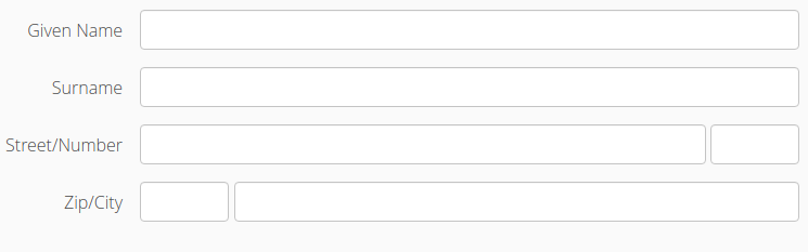
The relevant code for the class declaration and a part of the field declarations are given in this code snippet.
@UISection(caption = "Address", layout = SectionLayout.CUSTOM)
public class AddressSectionPmo {
...
    @UITextField(position = 2, label = "Street")
    public String getStreet() {
        return street;
    }

    public void setStreet(String street) {
        this.street = street;
    }

    @UITextField(position = 3, label = "Number")
    public String getNumber() {
        return number;
    }

    public void setNumber(String number) {
        this.number = number;
    }
The corresponding part of the html file may looks like this. The used css classes are not part of the default stylesheet.
<div class="line">
<div class="label">
<div location="street-label"></div>
/
<div location="number-label"></div>
</div>
<div class="component">
<div style="width: 100%;" location="street"></div>
<div style="width: 6em;" location="number"></div>
</div>
</div>Button in Section Header
Sometimes it is useful to have a button in the sections header, for example to open a special edit dialog. This can be achieved by implementing the interface PresentationModelObject with the method getEditButtonPmo(). The returned ButtonPmo defines the button and its behavior.
Simple Vaadin Layouts
Beside the section there are some simple Vaadin layouts that can be created with the corresponding annotations:
-
@UIHorizontalLayout
-
@UIVerticalLayout
-
@UIFormLayout
-
@UICssLayout
Some of these annotations may have special parameters to configure the alignment of the contained components.
To create the UI from a PMO with these layouts you should use VaadinUiCreator. The PmoBasedSectionFactory is only usable for @UISection whereas the VaadinUiCreator could be used for all kinds of layouts.
|
SectionID
Each HTML element of a layout may define an ID. This can be used, for instance, to identify a section for UI testing. By default the simple name of the class is used as the ID. Alternatively the annotation '@SectionID' can be used to specify a method that returns the ID for the section.
A method annotated with '@SectionID' is called by linkki when the section is created. The ID remains the same for the duration of the session and is not updated dynamically.
To access the section ID, the helper method Sections.getSectionId(Object) may be used.
| Although the concept is named SectionID it is also applied to all kinds of layouts. |